Waypoint NZ Production 04: Feedback, Polish, and Post-Mortem
Welcome to my final blog entry as part of refining the Waypoint NZ brand concept! After creating the foundational structure of my home page in my last post, I began to reflect on how I could continue to improve on it without compromising on my goal of keeping the User Experience as intuitive as possible. During this time I sought to receive feedback, and in doing so I ended up with a few key points that I could use for further refinement:
My webpage is clean, pleasing, and modern - but it’s still missing elements to give it a distinct brand personality. When the user clicks onto my page, do they immediately understand what my brand is? How could I move to implement this, without over designing elements or allowing scope creep to get the better of me?
Do I have enough content? As I’ve spent the majority of my production time on developing my brand personality, as well as learning the WordPress + Elementor + Kadence workflow, how can I move to introduce meaningful content that speaks true to the purpose of my website, without designing and writing articles for a series of bespoke webpages and guides?
How is the User Experience? In terms of the structure of the home page I think that it’s sound, but how can I build on this further in a way that’s additive? Also, up until now I’ve designed with the Desktop view in mind, how does the web page look on Mobile and Tablet devices - is the design responsive to different screen sizes?
A useful note of feedback that I received was that I should introduce my logo and name in the landing page, as although it’s visible in the header, it’s important to place it front and center so that as soon as the user loads into the website, they’re immediately cognizant of my brand and its purpose. As I had a lot of empty space on the landing page, it was a relatively simple addition to add the brand name; I used my header font, Plus Jakarta Sans, but in order to give it some more texture I customised the header text in CSS so that it had a two respective font weightings between “Way” & “Point” with a light weighting, and then bold and italics being used respectively. I left out the “NZ” portion from the name, as I wanted to leave open the possibility for “Waypoint”, to be a standalone brand entity, able to be used for other travel destinations and contexts beyond the scope of this project.
Another overarching feature that I had been wanting to add in as part of refinement, was to give more depth to the overall User Experience by way of including more instances of motion graphics. I wanted this to be immediately apparent when loading the page, so I had the idea to animate the logo whenever the site refreshes. By experimenting with a few ideas, I decided that having the logo “roll” into view would be interesting for additional playfulness. I did have to modify my logo in Canva so that the scaling and proportions would suit better with the final result, but I’m quite satisfied with it. It’s a simple touch, but I feel like it adds an extra layer of design and personality to the product. I would then continue to pursue this goal of expanding on the UX for each respective section of the home page; adding extra motion graphics, playing with font weightings, elements changing to a different state when a user hovers over it e.g. reacting and changing colours. I played with some of the section breaks as well, but ultimately I only left one diagonal one between the two Hero sections for now.
One example of some additional motion graphics can be seen below:
In this video, another change is apparent in how the the white background of the webpage seamlessly blends into the footer image. This was a custom CSS class that I imported into WordPress, essentially by creating a linear gradient extending from the Call to Action (CTA) container, and gradually turning transparent as it extends over the footer photograph. I wrote previously that I wanted the footer image to be complementary to the landing page image, and I built on this theme by having the page content fade back into an image of NZ’s natural landscapes. I also used another unique animation for the CTA section for a similar reason to the initial rolling animation for the logo when loading in; a playful bounce animation that stands out from the otherwise simple slides and fade animations found elsewhere throughout the page.
As Waypoint NZ is at this point, a concept for a larger website project, as I centered my focus on the web design elements and brand personality, I still wanted to showcase some travel content on the home page, both to serve as a teaser for its broader content, but also to implement a genuine feature that’s in keeping with the websites purpose: to be an accessible nexus of content for people going on NZ Working Holidays. During my pre-production design brief I briefly wrote about the concept of having an interactive map available for users, so that they can quickly browse interesting places to visit, and things to do in New Zealand to serve as inspiration.
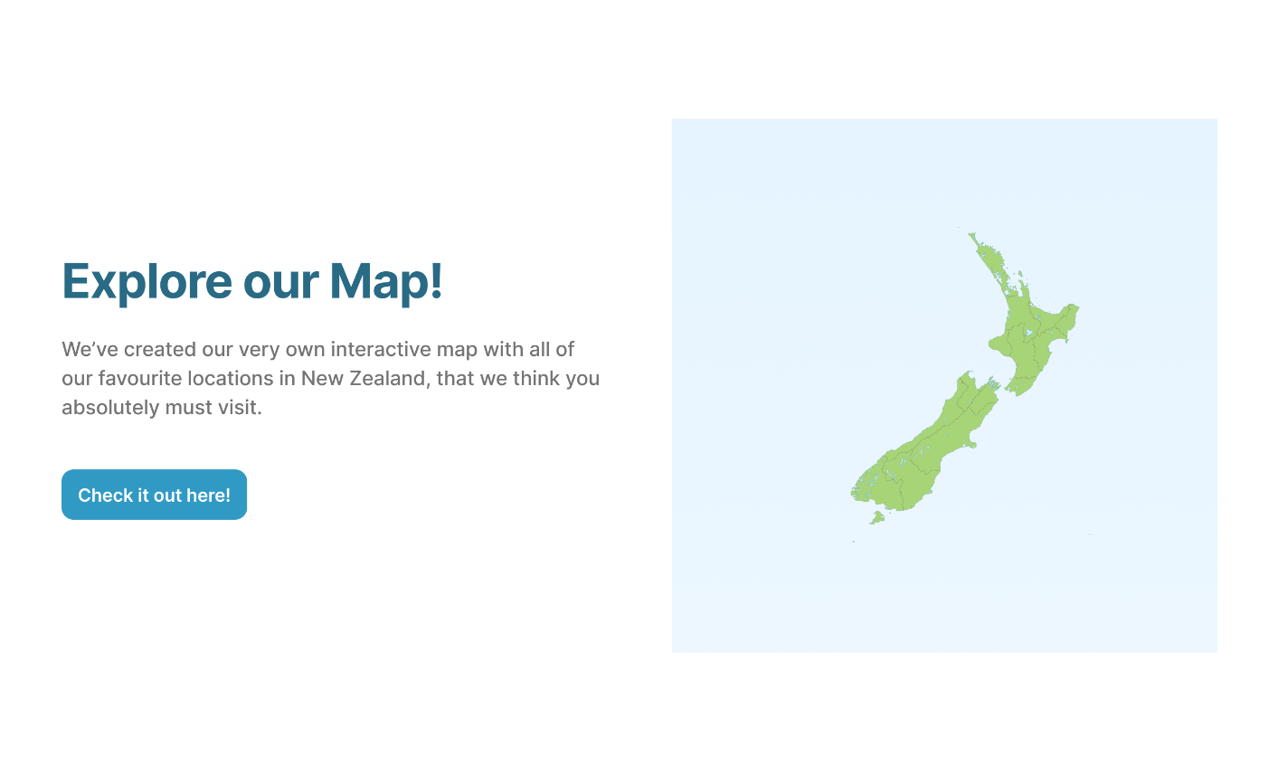
A screenshot from my third pre-production prototype. The idea was to have an accessible feature to quickly inspire users, outside of more comprehensive content such as guides or articles. This would’ve been on a dedicated webpage, and users could click around on different parts of the New Zealand map, and find content related to cities, museums, parks, beaches, camping spots, hikes, etc.
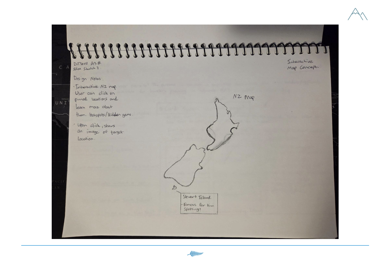
Another rendition of the map feature, from my early rough sketches and as shown in my pre-production document.
Whilst brainstorming for an additional feature to further inform the concept for Waypoint NZ, I returned to this idea of an interactive map, and decided to put it on the home page. By introducing it here, the user can quickly browse through content, it serves as a gateway for what’s possible for travellers, and aligns with the overall project’s goals. To implement the map, I leveraged a feature from Google called “My Maps”, where you’re able to create a custom map, populate it with your unique pins with your own text and images, and then share it online. “My Maps” even provides a HTML code to embed it in websites, which is what I did here; by creating an empty HTML container, I could then use the code to import the map in my webpage structure. I coordinated the colours of the pins as well as the map itself, so that it complemented the design of the home page, and I used a lot of my own personal knowledge from my trip in New Zealand in order to create it. The idea is that this map is a good starting point for users, as well as for myself as I look to build more elaborate content for Waypoint NZ. This was a great opportunity to reflect on the places that I visited on my trip, as well as showcase a few of the photos that I took whilst on my travels.
The final task that I had ahead of me at this point in time was to ensure that my web design was scalable and responsive for varying screen sizes. Whenever creating a website, the term “responsive design” is an important one to consider: just because a web page looks good on a mobile, doesn’t mean that it looks good on a PC monitor, and vice versa. When building a website from scratch, ‘media queries’ are written in CSS to account for the differences in screen dimensions, and to adjust visual elements in accordance to them. In the Elementor dashboard within Wordpress, however, the web design workflow is split into three sections: Desktop, Tablet, and Mobile. As you build one section, the other two automatically inherit the initial values from it, but these often don’t translate well to a different screen-size, and thus need to be modified to ensure responsive design. As I built my project on a desktop PC, and iterated on its design elements with a desktop user in mind, this meant that I had to go in afterwards and make various modifications to account for tablet and mobile users.
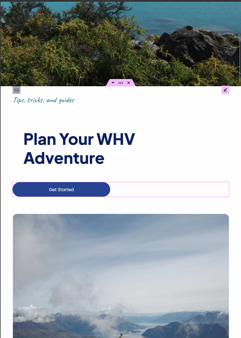
One simple example of broken formatting in “Tablet mode”.
As the website scales to different screen and browser window sizes, the formatting of the page can easily break without some guardrails in place, or perhaps the existing design simply isn’t compatible with the different sizing. In this example, my left-aligned hero text doesn’t look correct on a tablet, but I had already modified the image carousel below to be centered.
A polish pass is required for both tablet and mobile to maximise the integrity of the web design for different user devices. In this case, I would align the text in the center, modify the font sizing for legibility, and perhaps the spacing between the text blocks and the image carousel below.
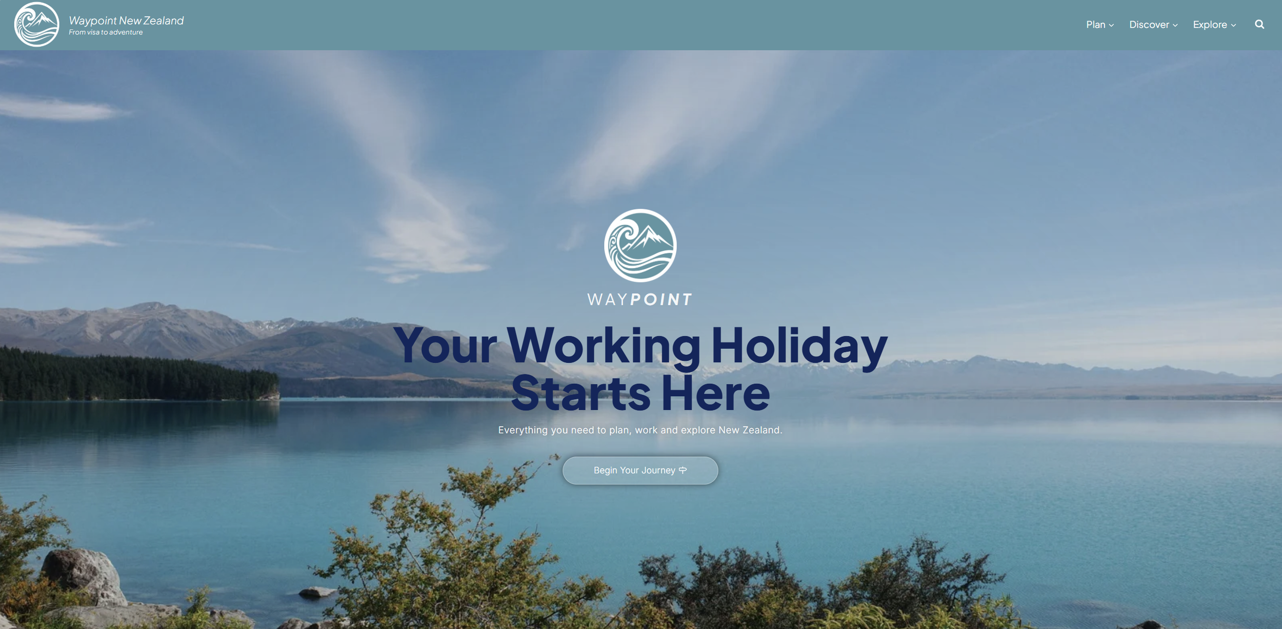
A few examples of the differently sized landing pages, and varying sections of the home page can be seen below.
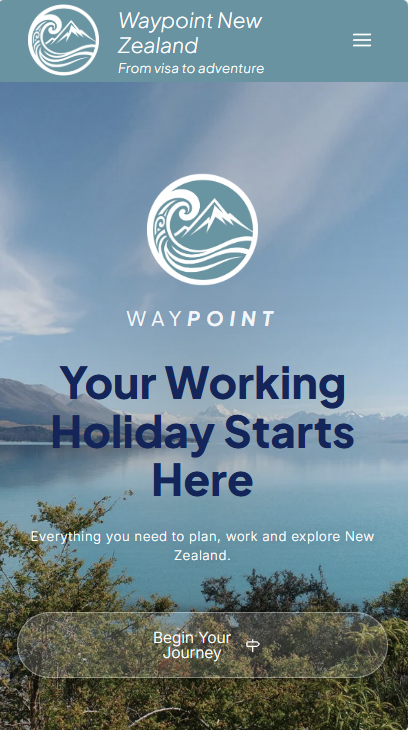
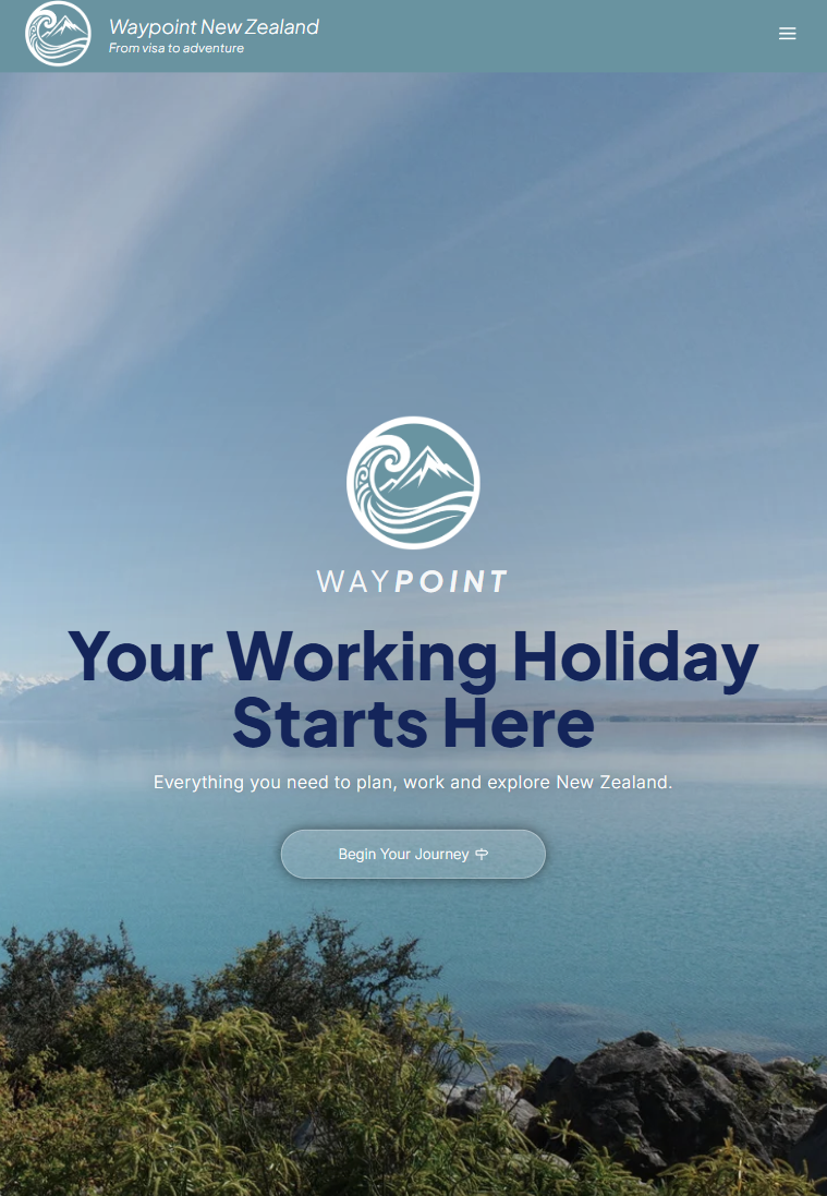
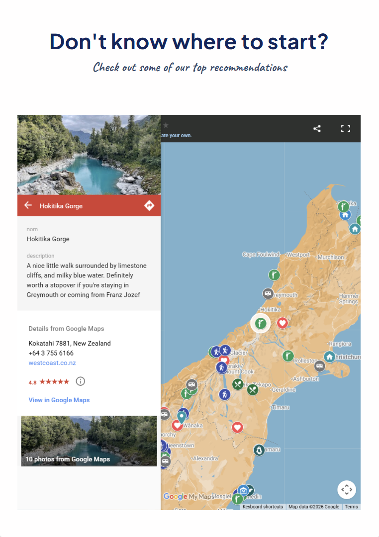
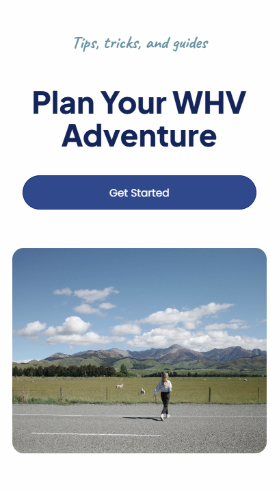
And with that, I’ve reached the end of the current production phase for the Waypoint NZ home page. The process was overall, quite smooth, as I was able to introduce more bespoke elements as I built on my skills in working within WordPress. If I had more time, I would’ve like to have built on the actual website content further with in-depth guides and content, but I had come to recognise the importance of getting my branding right before proceeding onto anything else. Looking back at my previous blog posts, I do feel like I was able to inject more personality into the webpage, although I maintained much of my focus in maintaining a product that’s modern and intuitive. I didn’t want to over-complicate the design - instead I largely focused on adding in motion graphics to convey additional personality. I do believe that more bespoke design elements would’ve served the project very well however; just by using my logo as a source of inspiration I could have implemented section breaks using mountains, the Koru symbols, or waves. I considered this as a stretch goal after working on motion design, responsive design, and creating the interactive map, but I just haven’t gotten to it as I felt that it was an complementary feature, and not one that’s core to the User Experience.
I experienced the most difficulties with this project during the beginning, whilst zeroing in on my branding, and when I was entirely unfamiliar with WordPress and Elementor. Through a process of iteration over the course of the last few weeks, I was able to overcome these initial obstacles, and ended up with an overall smooth development process. From this point, the next logical steps in building the project further would be to create more content for it, elaborate further on unique design elements, create social media channels, and foster an actual community and user base for it. I plan to keep working on this project into the future, as its a fantastic way to re-live my travel experiences, build on my skill-set, and to create content on a subject that I’m passionate about.
