Waypoint NZ Production 03: Creating the base Home Page
I ended my last blog entry with the below screenshot, which is the result of my first experiments with the WordPress + Elementor + Kadence toolset. First I’m going to discuss how I reached this initial result, and how I iterated and built on it further to create a more refined overall home page for my website.
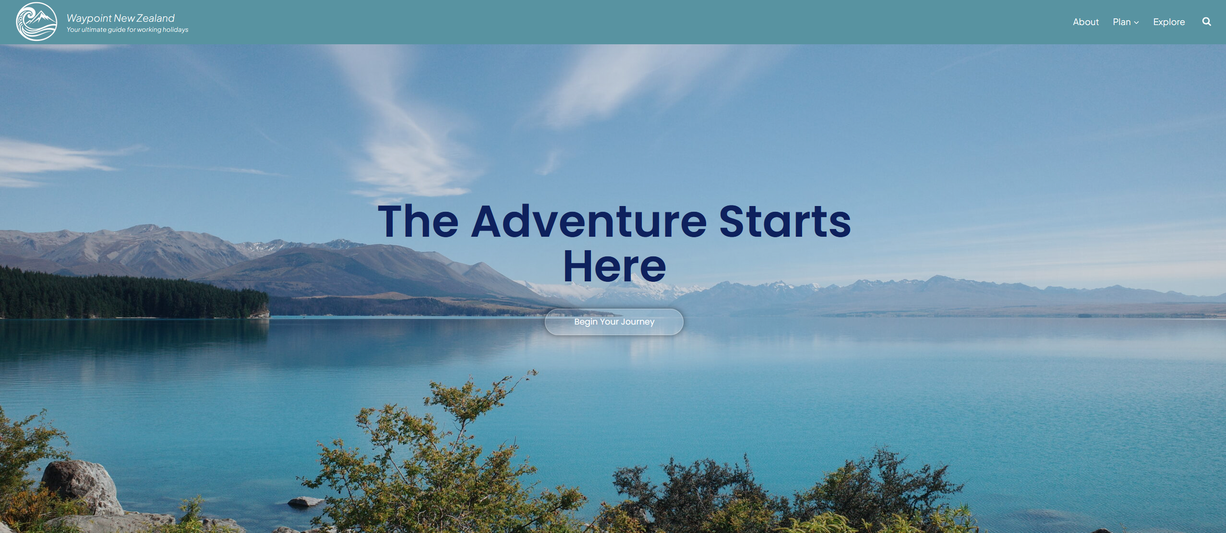
Landing Page
The very first thing that I began to work on is the website header. Going into my project, I remained acutely aware of the user problem that I was trying to address; my platform needs to be a reassurance tool for people that want to go on a Working Hoilday, but don’t know where to start. I also knew that I wanted a brand personality that was ‘friendly’ in tone. I worked on my wording to reflect these two things; adding a tagline to the name of my website so that people knew what its purpose was, “your ultimate guide for working holidays”, and I wanted my navigation bar to reflect the user’s journey, whether they were planning, or exploring. Finally, I quickly included a link to an “About” page, as it’s common practice with websites. Finally, I added my monochrome logo next to the website title - I wanted to avoid a logo with colours because I didn’t want it to contrast too strongly from the rest of the overall web design.
From there, I started experimenting with header colours. My first thought was that if I were to have a nice hero image, that I should have a transparent header, with the navigation elements being contained in glassmorphic (frosted glass) buttons, to give off a clean look and allow the user to really immerse themselves in the target destination.

I really like this design motif with modern websites, as it keeps the user’s attention on the hero image, whilst keeping the header legible.
However, I wasn’t able to achieve the desired results that I wanted after some experimentation, as I am using the “free” version of both Elementor and Kadence so that it would require me to wrestle with CSS styling alongside their tools, and I didn’t believe that this visual element was particularly worth the payoff, at least at this early stage of development. Instead, I decided to change my header to the cool green hue, that I feel best represents the atmosphere of New Zealand from my colour palette, which I actually quite liked alongside white text and my logo. As evident in the the draft, I DID keep the frosted glass button, just in a different capacity.
From there, the next course of action was to choose a satisfying image for the landing page. This was an easy task, as I simply chose one of my favourite photos that I took whilst on my trip. The cool blues and greens are once again very representative of the target destination, and the weather was excellent on this particular day; with a million dollar view of both the famous Lake Pukaki and Mt. Cook (aka. Aoraki) overlooking us in the distance - this is one of the standout locations of the South Island, and the country as a whole. I wanted this hero image to act like a portal to draw users into the stunning landscapes of New Zealand, accompanied by a Headline that encourages them to bite the bullet and go there on a Working Holiday. As noted earlier, I kept the frosted glass button motif, and instead included it with a “Call to Action (CTA)” button. This is the only button of its kind on the entire website, and having the statement be something like “Begin Your Journey” is a nice motivational tool as well as heralds its importance.
As I continued to work on the landing page, I kept modifying the header and landing page, as shown below. I’ve included a video in order to show some of the dynamic elements that I also added over time:
These are iterative changes, but help to enhance the overall messaging and the appeal of the website:
I rephrased the wording on the header. My tagline is more concise and gives off a more friendly vibe, and navigation is now separated into ‘Plan’, ‘Discover’, and ‘Explore’ to appeal to different stages of the travel journey, and drop down menus for extra contextual information.
The Headline is more descriptive, specifically mentioning Working Holidays, and now has an added supporting statement to once again reassure the user that they’re in the right place.
The CTA button is now animated, changing colour and reacting to the user hovering over it (a reoccurring element on my home page). I also added a simple icon of a sign, which is thematic, slightly playful, and also functions as an arrow that you sometimes see on website buttons. Upon clicking it, it brings the user to the journey dashboard that’s further down the page.
Hero Section
Scrolling downwards, there’s a Hero Statement that asks the user to Plan their Adventure, which is accompanied by a description in the Caveat script font, intended to evoke the wholesome feeling of someone writing in a travel journal - this was an important element for me to include in order to maintain the balance between a ‘modern’ website, and one that has a grassroots and friendly atmosphere. With some motion graphic effects, another CTA button appears, ‘Get Started’, which is intended to take the user to another webpage with tips, tricks, and guides. This text shares its space alongside an image slideshow, which having spent some time experimenting on, ultimately settled on the following rationale:
Unlike the landing page, this slideshow needs to showcase people experiencing a trip in NZ: traveling on the road, hiking, experiencing different landscapes, etc. I wanted to include some other elements of the user’s journey (e.g. working) into the slideshow as well, but at this time I decided to center it on people experiencing NZ’s natural beauty, as that’s a primary motivation for why people go there in the first place
I wanted the images to speak for themselves, and once again, encourage the user to imagine themselves in these same environments
The slideshow needed to show variety, whilst feeling cinematic and not be bogged down by having too many photos
Upon clicking the “Get Started” button, users will be transported to the planning section of the website, that provides general guides and tips related to useful resources to help map out their journey, covering topics such as purchasing a vehicle, comparing options for banks, registering with the NZ tax system, which cities to arrive in from abroad, etc.
About Us
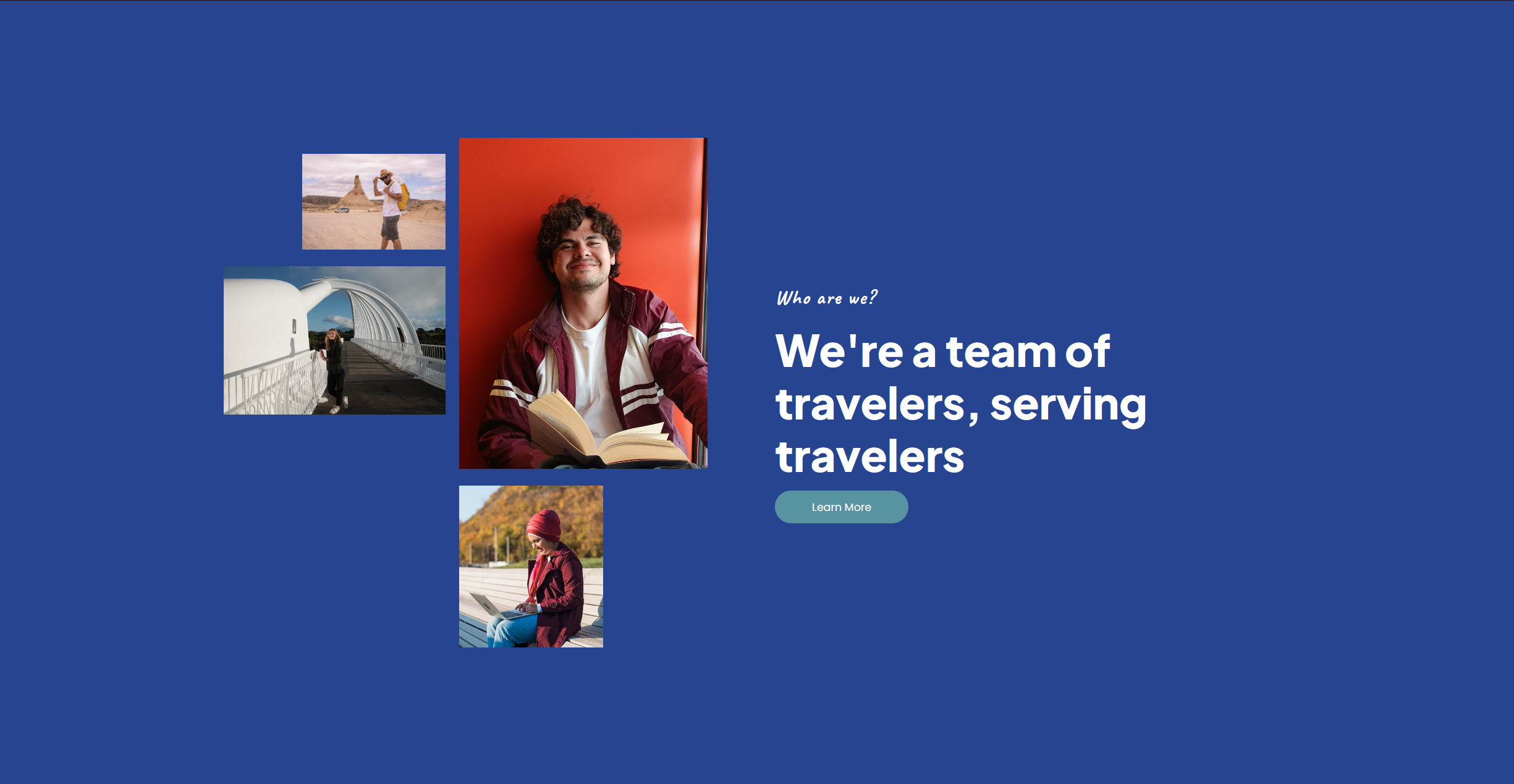
Every brand has a unique story and team behind it, and keeping with the overall theme of reassuring users, I felt that it was important to include this on the home page. As someone who has actually traveled to New Zealand on a Working Holiday, its important for me to share my own personal story and why I decided to create Waypoint NZ in the first place. This helps to establish trust with users, grounds and emphasises the human element of the brand, and fosters that feeling of being in a community of like-minded individuals. Using a statement that says “We’re a team of travelers, serving travelers” keeps this simple and descriptive, as well as another brief section in Caveat, and displayed alongside a collage of our team. I once again used some simple motion effects when the user hovers over the photos to keep things playful and dynamic, and used one of the deep blues from my palette to add in some colour contrast against the previous sections - using the green hue from my header to connect the elements together.
The idea is for the “Learn More” button to lead to a summary of why the platform exists, what motivated the creators to start the project, its story so far, achievements, goals, etc. Followed by a card-based section that allows users to “Meet the Team”.
Journey Dashboard
Next, we have arguably the most important section of the home page, and what I call the “Journey Dashboard”. The purpose of this section is to serve as a touch-point for users to quickly find content that’s relevant to them, no matter what stage they’re at with their New Zealand travels. It’s broken up into four sections, “Dreaming”, “Arrival”, “Working”, and “Exploring”, and clicking on the corresponding section takes them to a high-level view of curated content that’s suitable for them:
“It’s Just a Dream”
Motivational content - travel stories from myself, other team members, or selected community members talking about how traveling around NZ is worthwhile. How to hit the ground running
Key highlights of what you can experience in New Zealand: hiking, road tripping, camping
What kind of work is available - whether it’s volunteering in exchange for accommodation, or working seasonal jobs to help fund their travels
Some of the standout locations that you can expect to see: Mt. Cook, Rotorua, Stewart Island, Milford Sound. A mix of the the expected locations, as well as hidden gems
“I’ve Arrived”
Content to help users navigate their first steps as they land in the country e.g. Administration, bank accounts
Many working holiday makers wish to have their own vehicle, whether it’s a car or a camper van, so here the user would find relevant articles to explore their options
Articles discussing things to see in their arrival city e.g. Museums in Auckland
Accommodation comparisons for those that wish to stay in one location as they find their feet
“Looking for Work”
Comparisons between available options for temporary work: hospitality, tourism, farm jobs, agency work
Where to find work depending on location, and which places are hiring in regards to the season; “when is cherry picking season, and where?”
For those that are Digital Nomads, relevant content to help them facilitate working remotely, co-working spaces in cities, etc.
Testimonials and traveler stories for working in specific industries and locations
“Exploring NZ”
Travel itineraries
Recommendations of tour companies and experiences
Breakdowns of specific regions in NZ, and what value that they offer for travelers
Lifestyle content: What’s it like living in a van? What are my options for camping (paid vs free), adapting to life on the road, etc.
This is just a very high-level summary of what information people are looking for when they decide to go on a Working Holiday, and me trying to cover as many bases as possible so that the user will feel encouraged and motivated to go on their trip, and continue using Waypoint NZ as a valuable resource for their journey.
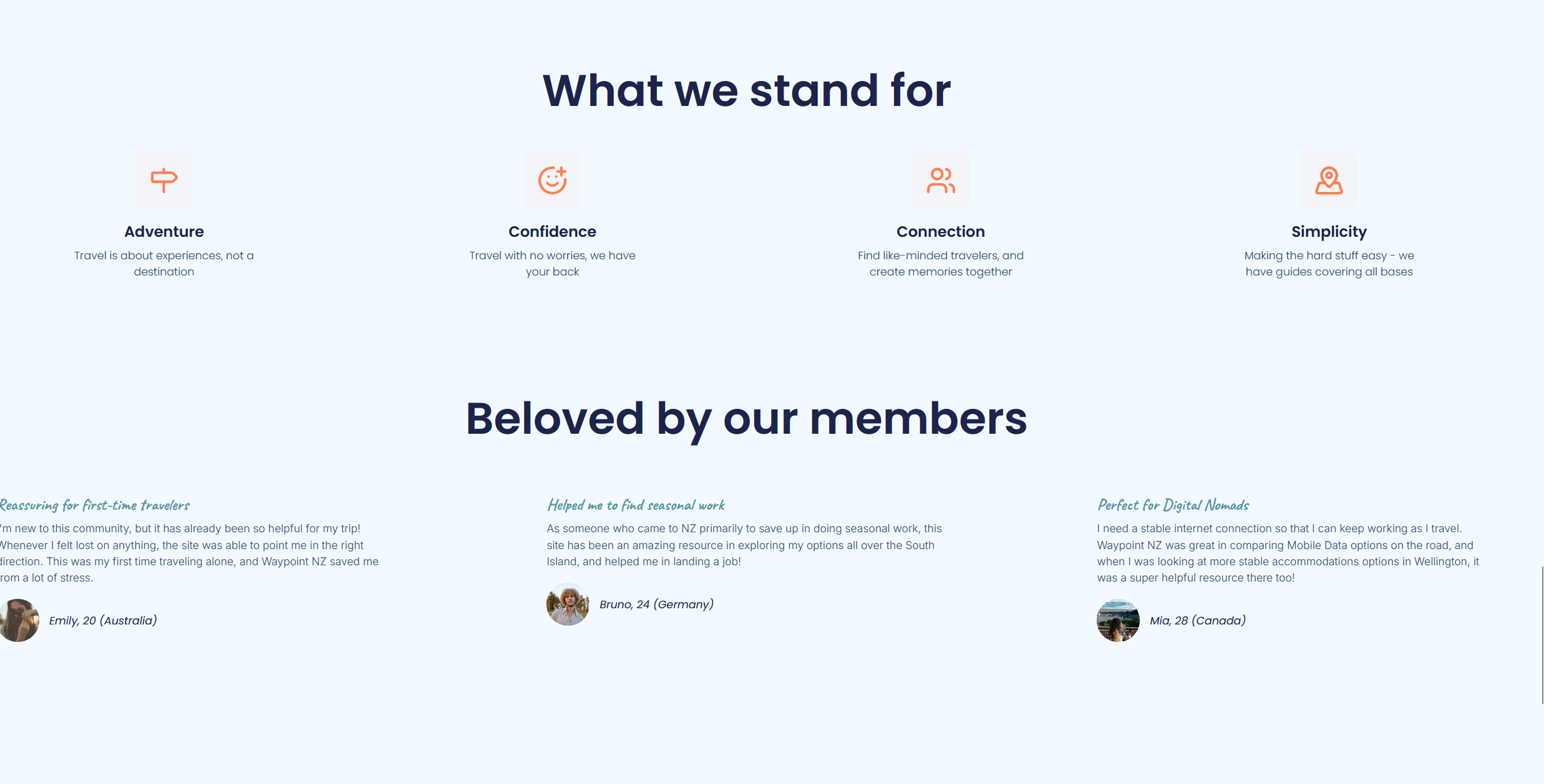
Reassurance Panel
The purpose of this section is two-fold; to tell users what they can expect to get out of this website by sharing some encouraging brand values, as well as testimonials from members who have already found value in the platform. I used Lucide’s iconography to help illustrate our objectives, and I created the user testimonials from the foundation of the personas in my blog post about branding. Each testimonial is designed so that it addresses three different types of travelers, illustrating the broad coverage that my brand is able to deliver. I used my “Coral Glow” hue for my icons, as I felt that it would provide a bit of a warm contrast to the cooler tones displayed elsewhere through the page, and once again, I used Caveat for the brief summary of the testimonials.
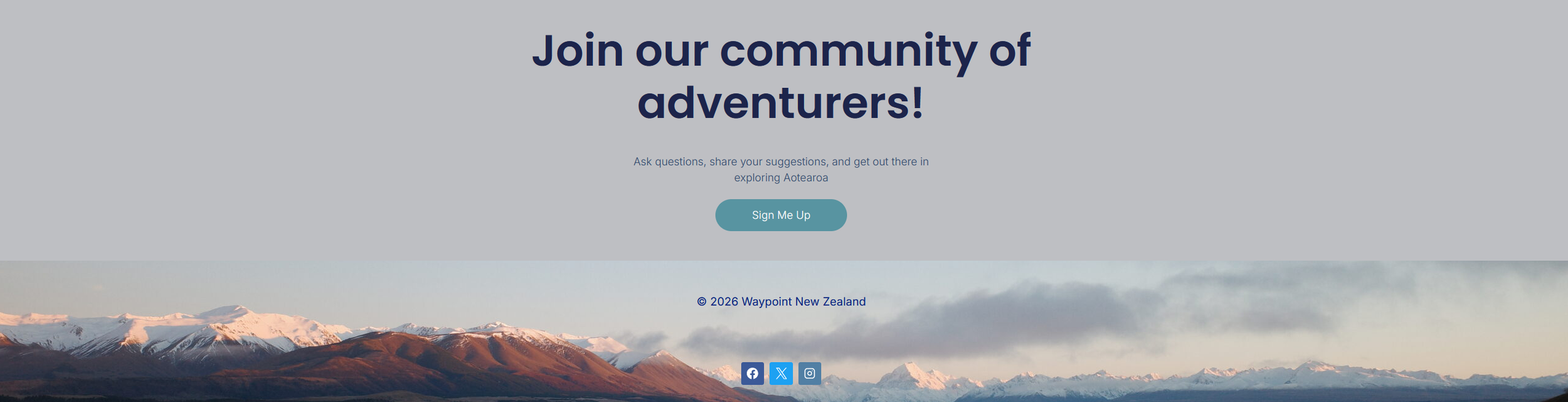
Final CTA and Footer
As my intention is for Waypoint NZ to not just be a repository of guides, but also to be an active community that helps one another, I made sure to include a final Call to Action that encourages users to join said community. By engaging with us, as well as fellow travelers, this also helps to encourage users, with the added benefit of bringing more content to the platform. The statement accompanying the CTA serves a similar purpose, and tells people to go and explore New Zealand.
I selected the footer image as a complementary visual element to the photo that’s on the landing page - both photos were taken in a similar location, but the footer image is taken at dusk. This created a bit of continuity in theme as the user reaches the bottom of the page, as well as just being another pleasing vista of the natural landscapes that travelers can expect from the country. It feels warm, and reassuring. Widgets for social media accounts are also included here, the coloured logos contrasting well with the background image.
Overall, I’m pleased with the current layout of the home page. It primarily exists as a “portal” to content that is to exist elsewhere on the website, is easily legible, and most importantly, it exists to solve the user problem of providing reassurance. I’ve considered adding extra sections to the home page, such as adding a card-based system for the “newest articles”/user generated content, or the interactive map mechanic that I discussed in my Design Brief - letting users quickly browse some of our recommendations in an intuitive manner. I may come back to these ideas as I continue to work on my project. This post was at first intended to be an overall development breakdown, but I felt like analysing my design decisions for the premier website page would be insightful! I enjoyed experimenting on it, creating it, and discussing my process in this post. Thanks for reading this far.
