Gateway WHV Production 01: Branding Style Guidelines
As I begin Production on the Working Holiday Gateway NZ project, I’ve reflected on what the brand is meant to be, and how it should be presented. Identifying the user problem was the easy part: I want to create a web-based platform that provides holistic guidance for people that want to go on working holidays, centered on the destination of New Zealand, and facilitating a smooth transition from planning their trip, to actually doing it. WHV Gateway is meant for anyone who wants to pack their bags and go on an adventure, but feels apprehension due to the breadth of information online. In order to address this key issue, I want my platform to deliver a user experience that gently guides visitors, builds trust in the platform and encourages them to return - being an evergreen resource for all stages of their trip.
But it is here that I’ve reached an impasse; how do I create a brand that’s memorable? Aside from the user problem, how do I forge a brand identity that stands out from other travel websites? I created three landing page prototypes as part of the pre-production process in DIT3000, all of which have a clean, but sterile design - If I removed the name from the website’s header, the user wouldn’t know what it is, as it just looks like any other NZ-based travel website. The first Prototype, which I mocked up in Canva, uses my predefined colour palette and is somewhat representative of the project’s overall direction at the high-level, but based on my own thoughts as well as peer feedback, there are a few key areas to address:
The website needs to transform from being a generic tourism information website → to being a legitimate travel companion. How can this be done, and what is WHV Gateway’s style that sets it apart from the competition?
How can I maintain an intuitive UX experience, without over complicating design? What visual elements should I use? How are user’s going to navigate the website?
What is a distinctive brand personality that allows for me to resonate with my audience?
How do I get the audience involved? Travelling is a journey of discovery, and everyone has their own unique stories. How can I leverage this so that it can serve my platform? E,g, User stories
I’ll tackle each of the issues one-by-one, and in the process develop my brand to stand out from the rest. I’ll be working off my initial Prototype as a base.
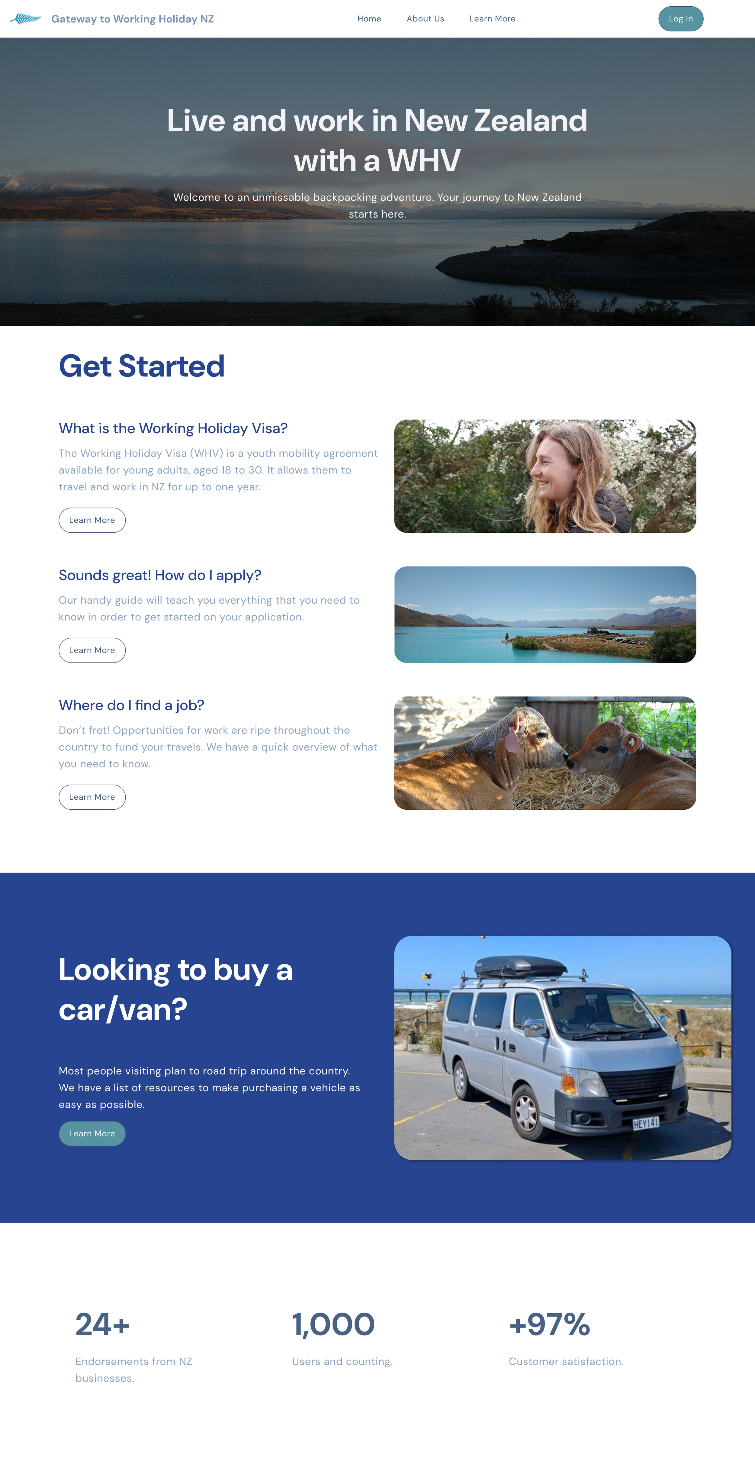
1st website mockup, made in Canva.
First of all. What are some key words to describe WHV Gateway? Based on the user problem, and my target audience being 18-30 year old travelers, I’ve settled on the following:
Curious
Youthful
Friendly
Adventurous
Authentic
Helpful
Human
This is a no-frills audience, seeking to live life to the fullest. Maybe they’re fresh out of high school or Uni, or they’ve worked for a few years and want a lifestyle change. With that in mind, I decided to create a few user personas:

Emily (Australia)
20 years old, worked for a few years out of school and wants to mix things up on a gap-year. She’s nervous about traveling alone for the first time, and needs reassurance to help her make her decision.

Bruno (Germany)
24 years old, he has already done his fair share of traveling around South-East Asia. He’s coming to New Zealand in order to find seasonal work so that he can save money for more trips afterwards. As a result, Bruno is budget conscious and wants to keep things affordable.
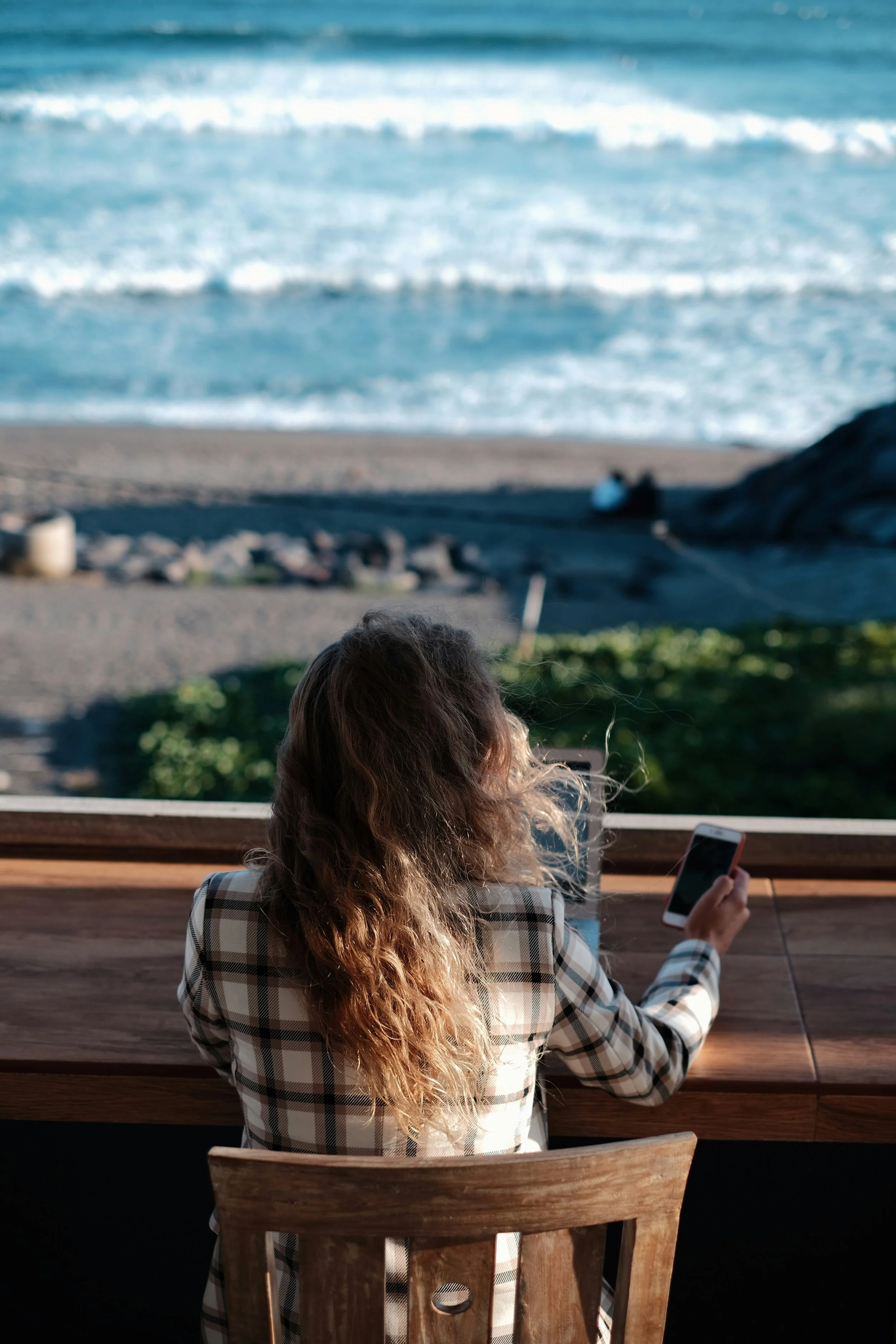
Mia (Canada)
28 years old, she has finished her studies, started her career, and now travels abroad as a Digital nomad - working remotely as she settles down in various countries from time to time. She needs access to a stable internet connection and accommodation as she makes her way around NZ.
Images courtesy of unsplash.
With these personas in mind, as I design the branding for my platform I need to reflect on whether these decisions are helpful for these people. It’s not enough for a design decision to look nice, it also has to serve a practical purpose. Ultimately Gateway WHV is supposed to bring peace of mind to each of these individuals, despite their differing goals & circumstances for travelling in New Zealand.
In terms of design elements, I’ve already established a base colour palette, as part of my pre-production in DIT3000. I still think that this is a good foundation to work from, but maybe introducing at least one contrasting colour would be useful. This additional colour would be used infrequently, for elements such as hover states for buttons, icons for added emphasis, progress bars, etc.
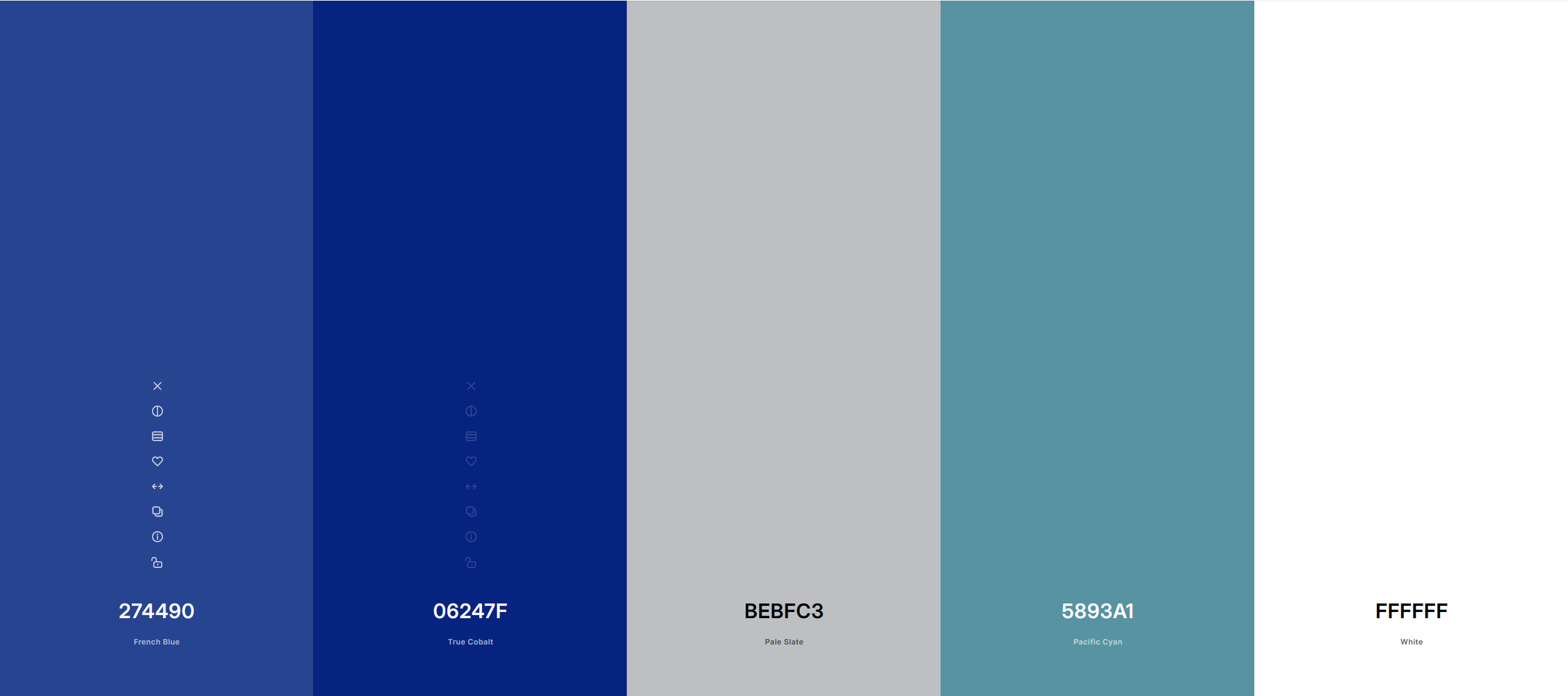
Palette: Vintage Koru
“The colour palette for Gateway to Working Holiday evokes elements from New Zealand’s natural environment: cool and soft colours, with pastel hues. This visual direction is authentic in portraying the target destination, with the added benefit of helping users to feel relaxed and providing visual clarity as they navigate.” - DIT3000 Design Brief

Coral Glow
Coral glow is a representation of the warmth of Kiwi hospitality, evoking the feeling basking in each sunrise and sunset while living the adventurous life.
Next on the list of foundational elements for the website, is Typography. As previously stated, the primary goal is to have a clean presentation, so it is key to have one an appopriately modern website font for heading text, as well as another for body text. In my Design Brief, I settled on Montserrat for Headings, and Zain for the body text. However, when researching other travel sites, I was inspired by Polarsteps; a popular travel-oriented website where users are able to track their journeys in real-time, and optionally use that data to create a book that is delivered to their door as a momento of their trip. Polarsteps is an amazing platform with a large community, and it is not one that I can directly compete with in the scope of this project. However they do have some website design elements that I can take inspiration from. One example is their interesting use of typography:
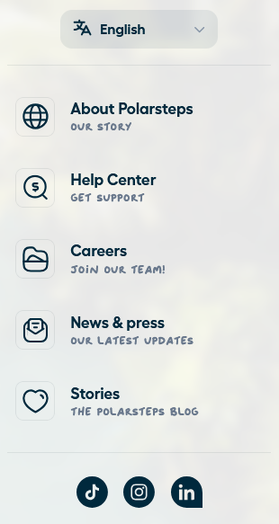
Polarsteps navigation bar.
On their navigation bar, Polarsteps cleverly uses a script style font to describe various areas of their site. This is used sparingly, and it’s not a font found on any line of text longer than a few words. Alongside some simple but easy to understand iconography, these accents help to create a brand personality that is friendly and inviting. They achieve this despite having a simple colour scheme that has a cleanly presented look, and is highly legible. I really appreciate this detail, and would like to incorporate some of this idea in my project. As it stands, I’m currently considering the following fonts for WHV Gateway:
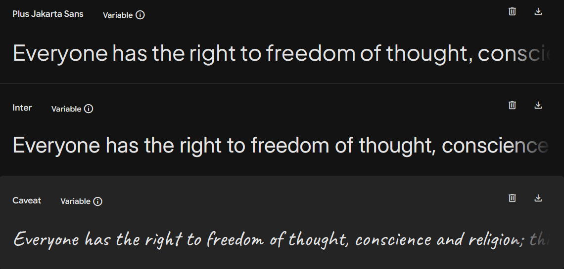
Headers - Plus Jakarta Sans, Body - Inter, Accent - Caveat.
Another design element used by Polarsteps which inspires me, is how their wording feels friendly and warm, even when the user is just navigating their platform. This warmth is also something that I want my users to feel. For my navigation bar, I can pull inspiration from my Design Brief project goal of providing end to end guidance for users in their working holiday journey: Consideration → Planning → Arrival → Settlement → Travel & Work → Beyond. I could structure my navigation using similar structures, for example: ○ Dream ○ Plan ○ Arrive ○ Settle ○ Work ○ Explore, or similar. Hovering over these quippy menu items would lead the user to a drop down menu with extra context (and subtitles), which will then take them to other webpages with appropriate. Having one final look at Polarsteps as an inspiration, lets examine its main landing page.
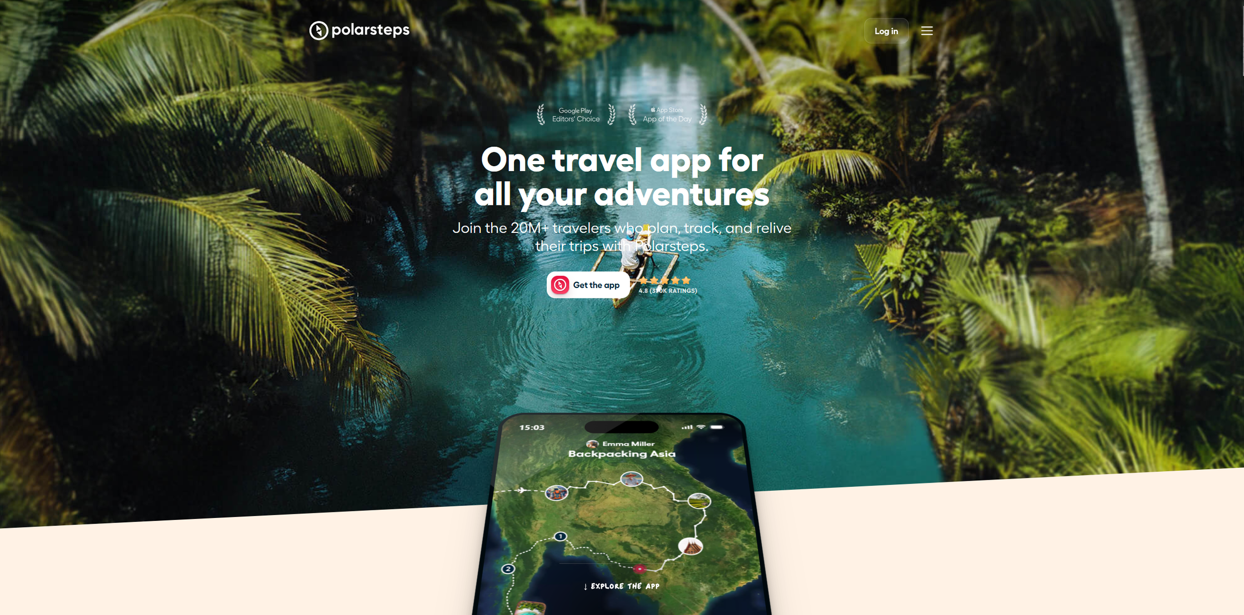
Some interesting design cues to consider here:
The hero image is on a gradient. This first impression, when working alongside other elements, helps to give the platform a casual, almost scrapbook feel. This angle works well for a quirky but modern travel platform.
The header is transparent, blending with the hero image - the log in button has an opaque glass effect on it to help sell this. It’s very subtle, but it’s an atypical detail in modern web design.
The nav bar is hidden behind a burger button. This keeps the header extremely clean, keeping the focus on the image, and its only when clicking on it that the user is introduced to auxiliary elements such as the script-style flavor text for menu items, as well as animated icons for a whimsical touch.
Overall, these cues maintain the feel of a modern website, but with some subtle elements which helps to make it feel a little more human. It is in these details that I find inspiration, and would like to evoke in my own landing page.
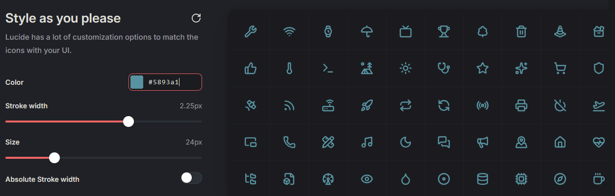
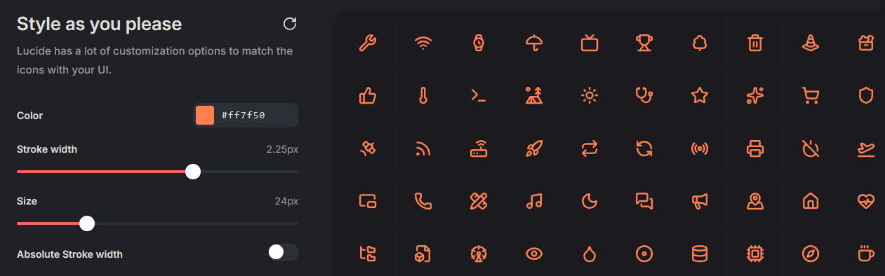
When it comes to iconography, these can be sourced from the open-source Lucide library, which hosts 1600+ vector files for displaying icons and symbols in digital and non-digital projects. An example using some of my colours can be seen below:
see more at: https://lucide.dev/
In terms of seeking inspiration from other large-scale brands, I looked beyond just travel websites, to brands that were positioning themselves in their respective markets. with a similar voice to my own. It has become increasingly common practice for organisations to publish their brand guidelines online for everyone to see, which is an incredible resource for collaborators, as well as for designers seeking inspiration for industry practice. Mozilla’s Firefox web browser is a good example, as their values and brand personality are centered around friendliness, with this being their mission statement, and something that I can learn from for my own branding:
“The web was meant to expand your world, with you at the helm.
But somewhere along the way, you became just a passenger. Defaults set the standard. One-size-fits-all algorithms shaped our experiences. Profits were prioritized and manipulation became the norm.
For most of us, the internet isn’t just a tool. It’s where you live, learn, create, connect, wander and escape.
It’s imperfect. It’s personal. It’s always changing. And it should be yours to shape. We remember what the internet was meant to be, and we know it can be that again.
It’s time for an internet that’s honest and transparent, one where people are the priority.
We’re not here to trap your attention — we’re here to give it back. We believe in a web where privacy is the default, not the upgrade. Where discovery isn’t driven by surveillance. Where control belongs to you.”
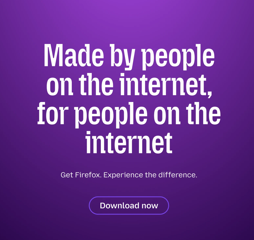
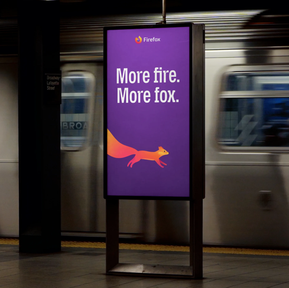
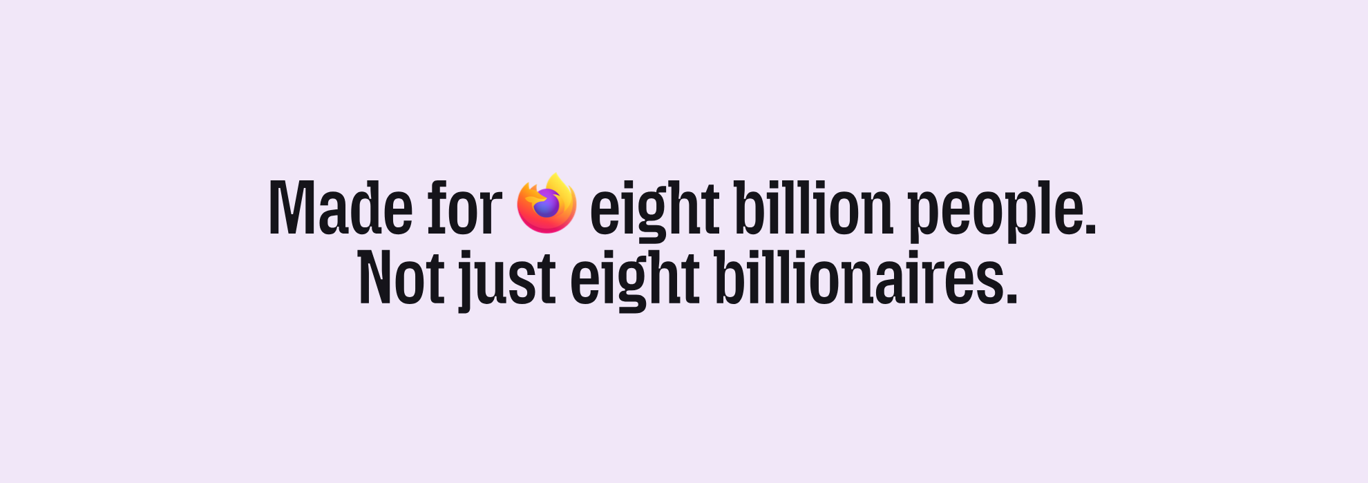
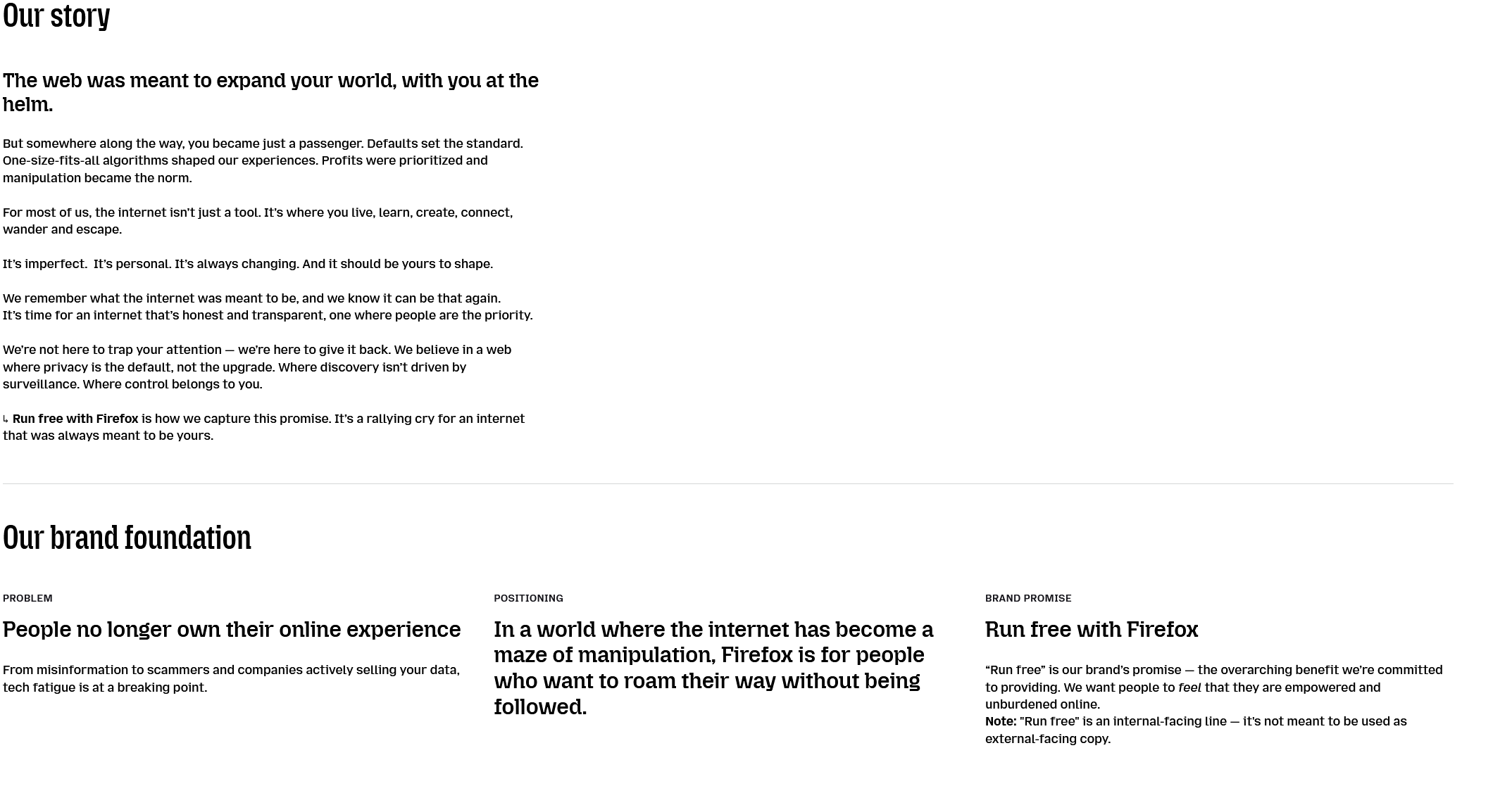
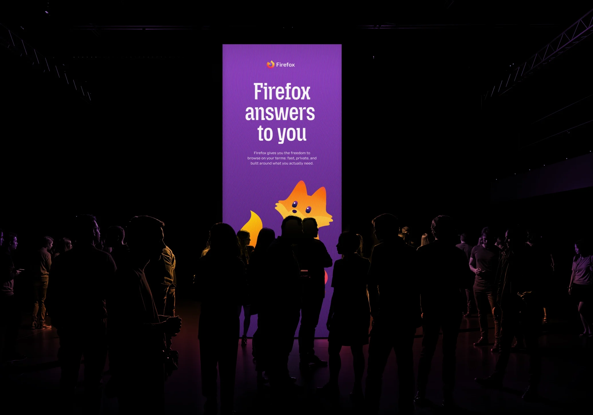
Firefox’s mission revolves around ownership. With the advent of the World Wide Web and its freedom of expression in the early days, everything was individually created - early websites were simple, hard-coded in HTML and CSS. Building out the early Internet was a community-led process, driven by users who were discovering a new digital frontier. Firefox wants to bring back that feeling back for its customers.
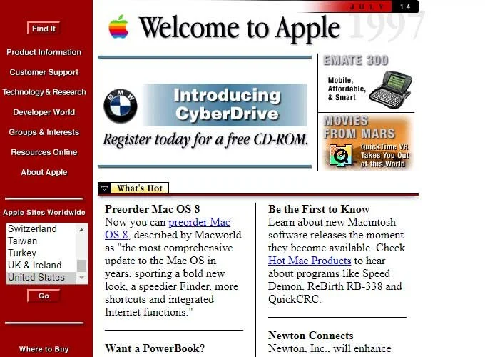
Apple’s first website. “Source: 50 Old Websites from our Digital Past”
How does any of this apply to my own mission? Well, it’s all about how brand messaging is used in order to provoke an emotional response in customers. Firefox wants its users to feel freedom and ownership over the internet, whereas I want my users to feel emboldened with confidence and discovery. These are two different emotional realms, but its strong emotional messaging, nonetheless.
Like the Web, the travel industry itself has become increasingly homogenised, and increasingly commercialised over time. The grand appeal of going on an adventure such as a Working Holiday, is to make your own way in the world and forge a unique adventure that is outside of your comfort zone. Whether it’s working on a farm, taking care of animals in a nature reserve, or hiking, each person should be encouraged to create their own stories and experiences, and what I want for Gateway WHV is to embrace, foster, and celebrate that idea. With all of that in mind, I’ve come up with a few key pillars for my brand:
Adventure
There's always more places to discover.
Travel isn't just the destination.
It's the experiences between.
Confidence
The best adventures start with a strong foundation.
Having reliable information helps people to spend less time worrying, and more time exploring.
Connection
Working holidays aren't only about travel.
They're about meeting people, finding opportunities and creating memories.
Simplicity
Planning shouldn't feel complicated.
Complex information can be delivered in a way that's approachable and enjoyable for everyone.
These ideas exist to inform my production process - whether its in my writing, my UI, features, or imagery.
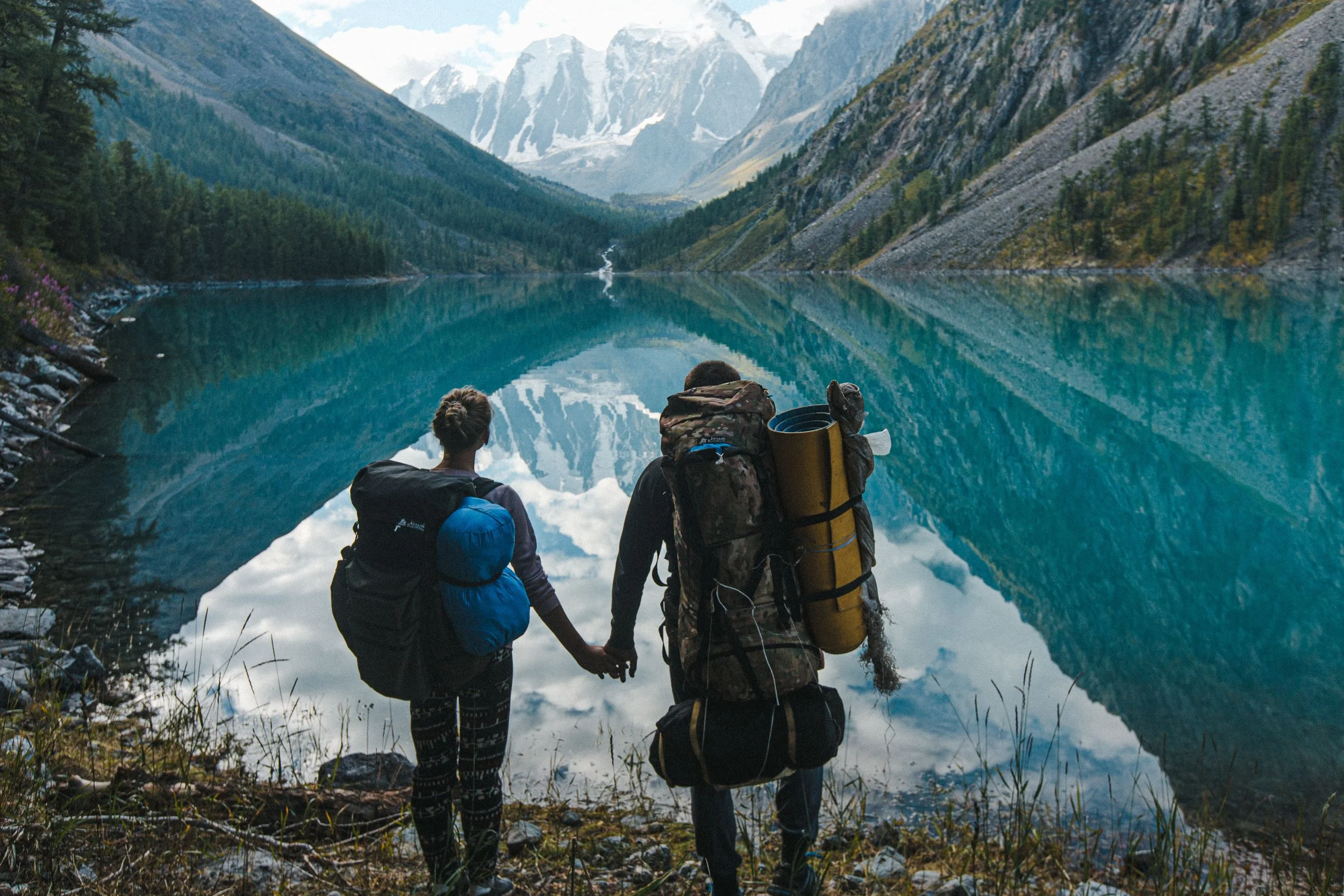
In my prototypes, I focused on using imagery that showed off NZ’s stunning landscapes, but one of the key pieces of feedback that I received back was to expand on variety of imagery and personalisation. It’s very common for websites to focus on photos of beautiful scenery to evoke the vibe of a destination, but this is inherently impersonal and generic. I don’t want to give off the vibe of a travel brochure, after all.
I’ve decided that it’d best to incorporate feel like they were taken by travelers in the middle of their trip, and to shift away from exclusively landscape. Some examples could be: a person overlooking a mountain, a campervan parked by the lake, a remote worker having a coffee at a cafe, hiking trips, fruit picking on farms, or people chatting in a hostel.
The goal is to make my audience picture themselves in New Zealand - this would align myself with my target audience on a more personal level.
Photo by Anna Shvets from Pexels: https://www.pexels.com/photo/couple-standing-near-lake-4015175/
One final aspect that I reflected on was the name of the platform. “Working Holiday Gateway NZ” is a descriptive name that highlights the purpose of my website, but it isn’t the most catchy to say out loud, nor is it easy to abbreviate for use in a logo, website headers, or even as a domain name. I looked at some other contemporary travel-related brands, and realised that their names weren’t 100% descriptive of their purpose - rather they have a level of ambiguity whilst being short and catchy: polarsteps, AirBnB, Lonely Planet, etc. Where required, a tagline can be used alongside the name of the platform in order to give some extra context. A shorter name, with an accompanying tagline, would help to enhance my brand. At first, I considered to incorporate “WHV” into “Gateway” e.g. Gatewhay NZ, but the lack of correct spelling just didn’t sit right with me - instead I considered the idea of using a simple and catchy title that alludes to the idea of planning, journeys, navigation, and exploration. With this in mind, I also came up with a simple monochrome logo vector, which illustrates some of the natural elements of New Zealand without being too explicit, save for a simple “Koru” pattern as part of the wave. The benefit of this logo and name for my brand, is that it could also hypothetically expand beyond the destination of NZ in the future with some tweaking. Ultimately, I decided to move away from ‘Gateway Working Holiday - New Zealand’, to:

‘Waypoint NZ’
‘Your ultimate guide for New Zealand working holidays’
After much research and reflection, I think that in writing this post I’ve come up with some tangible foundations for my brand personality, and how I want my customers to see my platform. I’m excited to keep on developing these ideas as I go, but I think that the information above gives me enough leverage to have a solid foundation for my branding.
